About
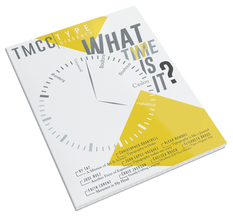
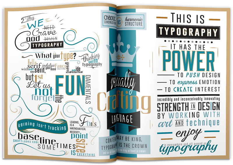
Here I had to design for a magazine called TMCC Type Dingbats. The cover and inside spread had to visualize and communicate my feelings about typography. The theme of the cover had to communicate a history of type and needed to incorporate the logo for TMCC Type Dingbats, created by me. This was one of the hardest things I've ever had to design because, at the time, I had no idea what to feel about typography. There was no research, it was more like soul searching. I decided I'm kind of on the fence when it comes to typography. I hope you can start to see that as you wander through the spread.


