About
Below is a growing list of websites that I have either redesigned or created from scratch. Each of them are unique in showing various ways I attack UI design, layout, functionality and responsive design. This website is also a personal example of my capabilities.
Original Website


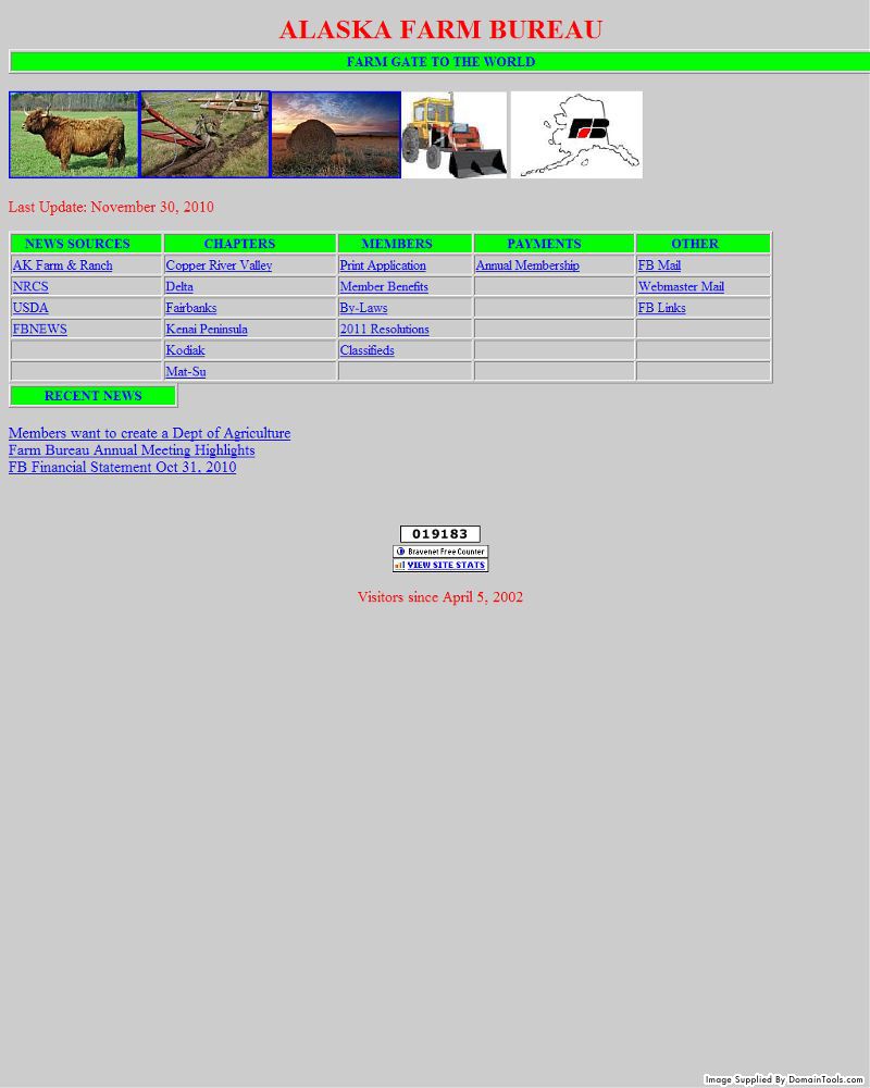
AFB
The Alaska Farm Bureau website was a total disaster. When I found the poor thing it was still stuck in the 90’s. It even used tables! I decided to redesign the website to suit today’s standards better. This is also one of my first attempts at web design and I always think it’s good to show what you came from.
nexa
This site is one of my most recent web designs. Nexa is built to not only communicate how the font can be applied in design, but also how well it can be expressed on the web. The geometric background was chose to reinforce the geometric shapes and help add a color pallet to the website. The image gallery is all images I mocked up using the font just to show it’s versatility and real life application.
